
Exciting trends in design 2019 from Pantone
Trends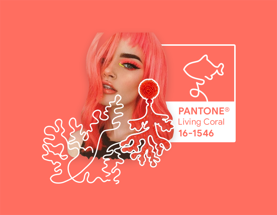
The well-known Pantone reported about the color that will become the most fashionable in 2019. Employees of the institution authoritatively present the hit color of the New Year. It will be coral (Pantone 16-1546 Living Coral). This is a coral color with a golden subtone.
The color trendsetter declares that in response to the boost of digital technologies and social networks, the company is looking for genuine and exciting impressions. Coral-orange color with a golden subtone, according to institution experts, “energizes and adds strength” and “symbolizes an innate necessity of optimism and a desire for joy,” it is said in the color description. Pantone considers that “Just as the coral reef is a source of food and shelter for marine life, the bright but soft PANTONE 16–1546 Living coral takes us into its warm and caring embrace, giving comfort and helping to keep afloat in our ever-changing world”.
Living Coral embodies our pursuit of originality. For 20 years, graphic designers are guided by the choice of colors from Pantone.
The color of 2018 was ultraviolet. I think the trend roams smoothly from 2018 to 2019. It is promised to use more and bolder colors, which gives graphic designers a field for experiments, and affords business the ability in the literal and figurative sense to stand out among competitors.
The network has already picked up the trend and has shown approximate bold site layouts in the new year.
How this shade of orange will be used in graphic design: on the pages of websites, in posts of social networks, in advertising, in accounts and colleges? I see this color bright, cheerful and life-affirming. It really fills the pages where it is placed with the sun. This is the color of youth and activity, the color of action and the life continuation.