
Brutalism as a new beauty philosophy
STYLE, GRAPHIC DESIGN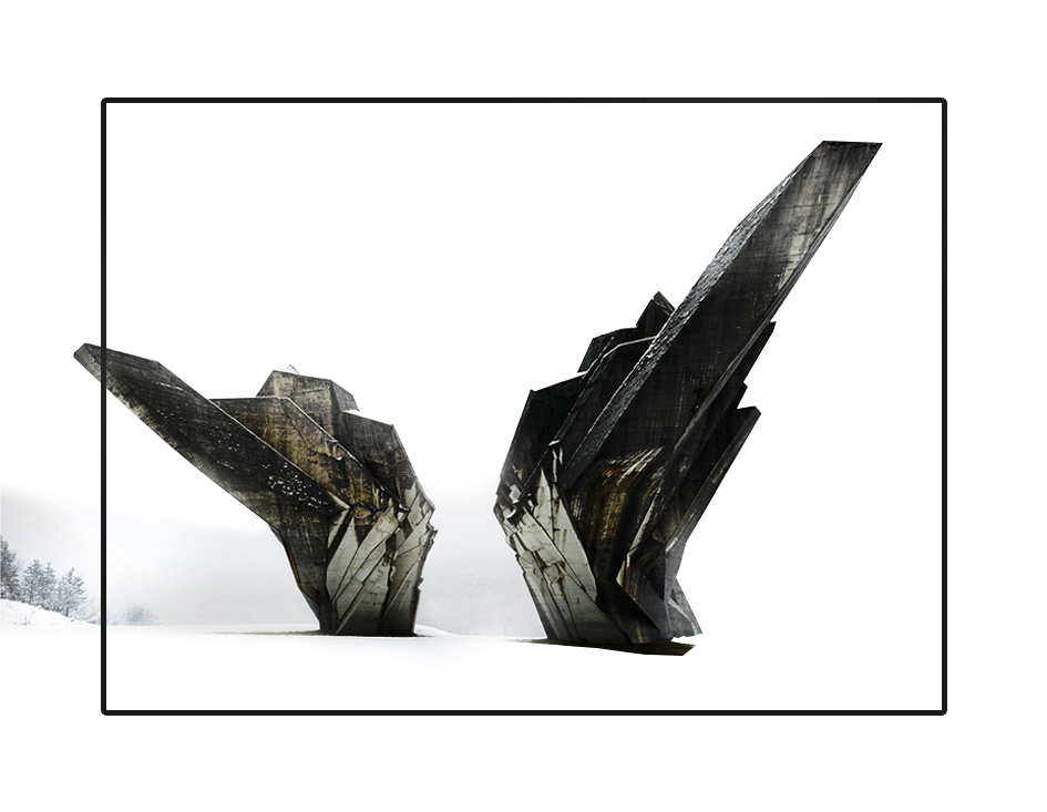
Brutalism is a rough concept, designed to capture attention. Its bold style has been used in design since the 50s of the last century, mainly for the design of posters and billboards (the direction originated in the architecture of the 40s and became a trend). Luxurious style in e-commerce has already become not so attractive for users. More and more famous brands make brutalism their schtick. This term was introduced by Le Corbusier, who believed that it was normal to beat people for bad design. In any case, brutalism came to taste by graphic designers as far back as 2016, starting to appear on the websites of artists, art agencies and people associated with art. And by 2017, brutalism received more attention due to the redesign of the e-commerce website Balenciaga.
And today, experts expect the continuation of the trend of brutalism in design.
It is characterized by shades of gray, brown and blue. This is a combination of crude ethnic motifs and imitations of defects in print. In graphics, it is the spirit of stenciled graffiti. Clothing may mimic a worn or dirty effect.
The main characteristics of brutalist design:
• Solid background, often black or white, without textures or shadows.
• An absence of various techniques – without gradients e.g.
• Only one font use.
• Design with sticking letters or non-volumetric elements.
• Lack of hierarchy.
• Lack of symmetry or spacing.
• Lack of a real color palette — the most common colors are green or red.
• The decorating looks like it has a lot of visual errors.
• Lack of animation.
• Images are either missing or black and white.
Brutal graphic design is special, and not many people will like it. Rather, old-school people, mostly men. Brutal design attracts attention. Recognition of a brand or company will increase tremendously. If the brand you are working with has bold style and rebellious spirit like Gucci, trend brutalism and its variations will be an excellent choice. Brightness, courage, straight lines, breaking the rules will help to create the right style. However, I think that in the case of crypto projects and exchanges it is better not to abuse it.
Every day, designers are told what decoration to apply for the brand. They are told how important visual content is, and that you can’t use too much text. Brutalism asserts that this is a lie imposed on us. Is it so? It is only in part. After all, a significant percentage of all people on earth are visuals. They need pictures, videos, graphics, etc. A naked text will not cause the desired reaction in their brain. On the other hand, there are too many kinks. I believe that a sense of proportion is necessary for every specialist who works with graphics.
Its time for bold design solutions! Do not be afraid of experiments and unconventional approaches in design. Perhaps, this is the project that will collect a bunch of awards and prizes in the digital sphere, and, what is more important, its consumers will remember it well.